BBrandon Alvarez 03 / 03
§ 03 — Case StudyIdentity · Web · Art Direction2026

Cannon Pro Cutz
& Stylz

Twenty years of craft behind the chair — and a brand that finally looked like it.

Client
Cannon Pro Cutz & Stylz
Sector
Barbering — Richmond, VA
Year
2026
Role
Sole designer — identity & web design
Scope
Logo · Identity system · Website · Signage
Live at
cannonprocutz.com ↗
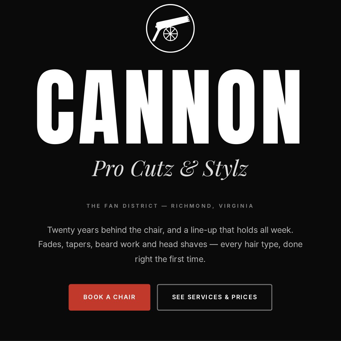
Cannon Pro Cutz & Stylz website hero — the wordmark on black with barber-pole edges
Overview

Cannon Pro Cutz & Stylz has been cutting hair in Richmond's Fan District for twenty years. Precision cuts, fades, beard work, head shaves — walk-ins welcome. The work inside was excellent. Everything representing it on the outside was not.

I rebuilt the brand from zero: a new mark, a full identity system, art direction for the shop's photography, and the design of the website the business now runs on. One designer, every deliverable — handed to a developer to build.

The Problem
  • 01A mismatch. Twenty years of skill presented with clip-art signage and a website that hadn't aged well. New customers were judging on the wrong evidence.
  • 02Category sameness. Barbershop branding defaults to the same pole, scissors and vintage-Americana kit. Nothing separated this shop from any other.
  • 03Practical constraints. Whatever I made had to survive a vinyl cutter, an embroidery machine, a 1-inch Instagram avatar and a shop window — in one colour.
Approach

Barbering as precision, not nostalgia

I threw out the retro playbook. A fade is a gradient executed by hand to a tolerance of a millimetre — that's engineering, and the identity says so. Sharp geometry, exact symmetry, fine rules, and a restrained palette that puts all the emphasis on form.

A mark that survives everything

The logo was drawn on a strict geometric grid and tested at its worst case first — one colour, one inch, cut from vinyl. Everything decorative that couldn't survive that test was removed. What's left works at every size the business will ever need.

Let the work be the colour

A tight, restrained palette with high-contrast photography. In a category that reaches for gold and neon, restraint reads as confidence — and it makes the actual haircuts the most colourful thing on the page.

A site designed to book

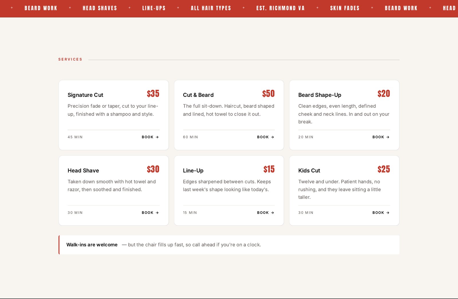
The website has one job: convince someone new, then get them through the door. I laid it out so services and prices are legible without scrolling past hero fluff, the address and hours are immediately findable, and "walk-ins welcome" gets treated as the headline it deserves to be.
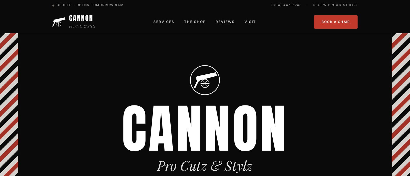
Fig. 3.1Identity SystemMark · Lockup · Palette
Cannon primary mark — a cannon in a circle
Full Cannon lockup — mark, wordmark and Pro Cutz & Stylz
Fig. 3.1 — Primary markFig. 3.2 — Full lockup
Ink#0A0A0A
Signal Red#C0392B
Bone#F8F4EF
Warm Grey#F0EBE3
Paper#FFFFFF
Fig. 3.4The WebsiteSection by section
Services and pricing section of the Cannon website

Fig. 3.4 — Services & pricing

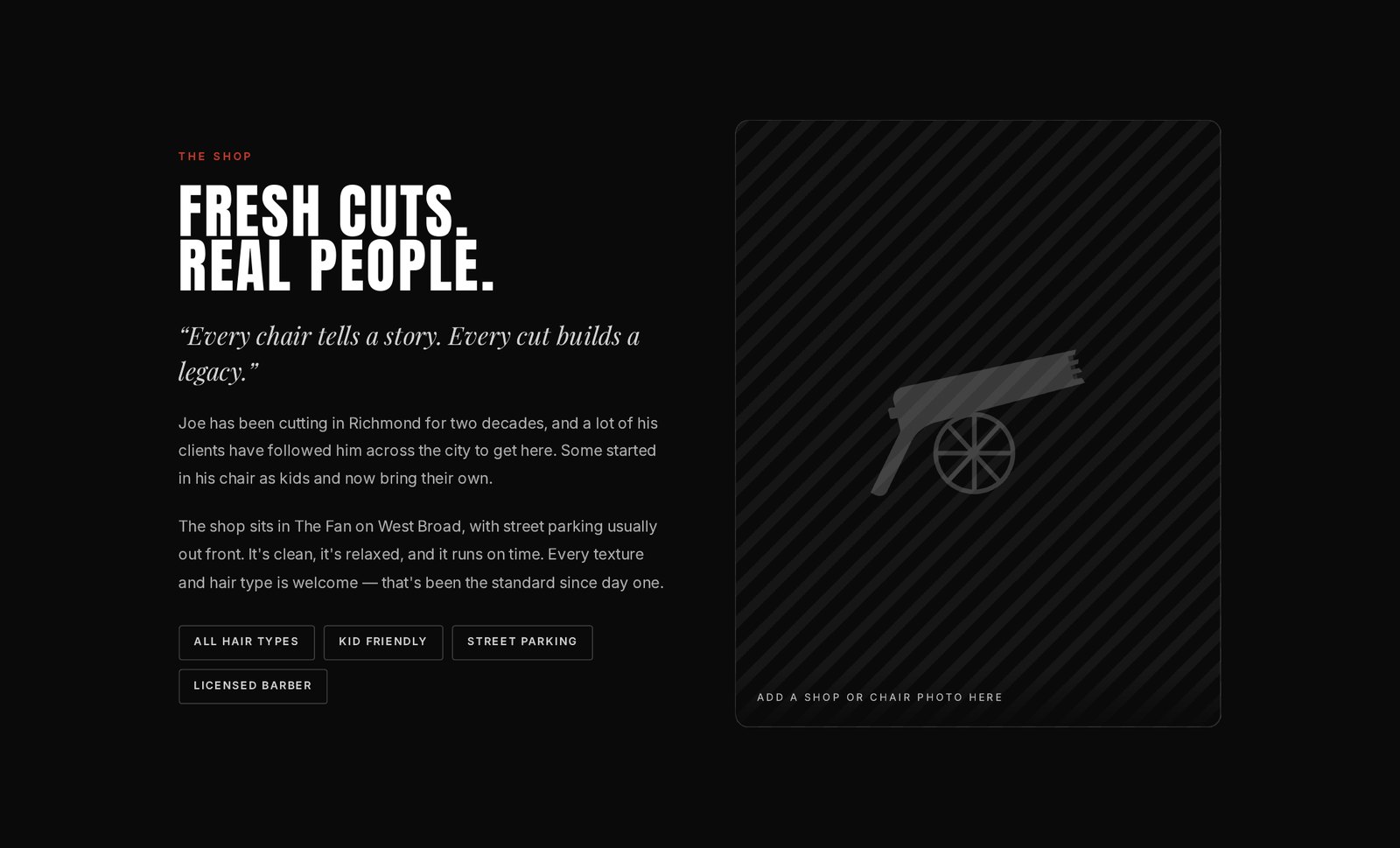
The Shop section — Fresh Cuts. Real People.

Fig. 3.5 — The shop

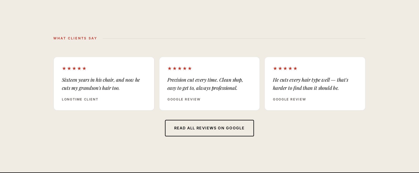
Client reviews section of the Cannon website

Fig. 3.6 — What clients say

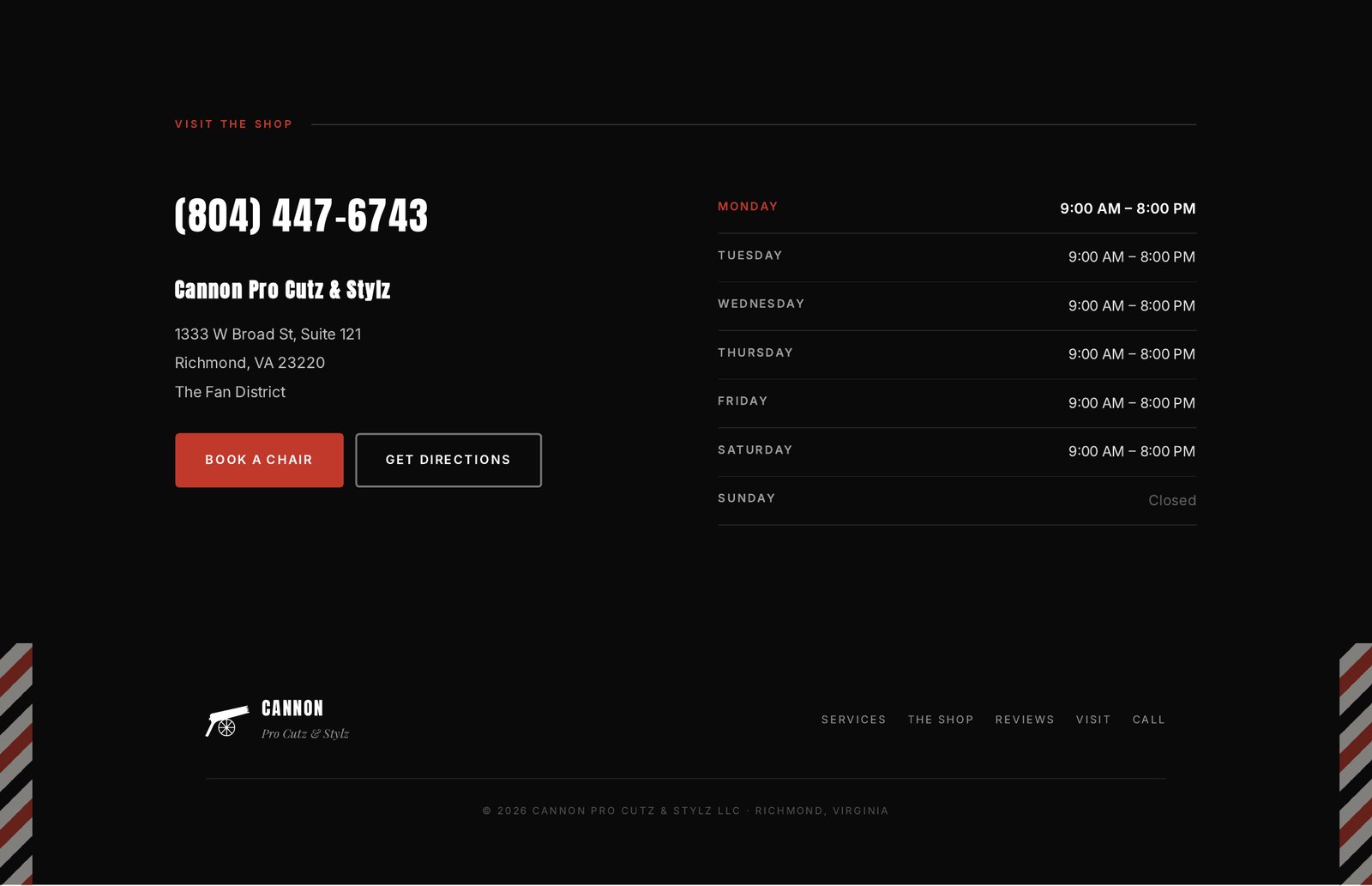
Visit the shop — phone, address and opening hours

Fig. 3.7 — Visit & hours

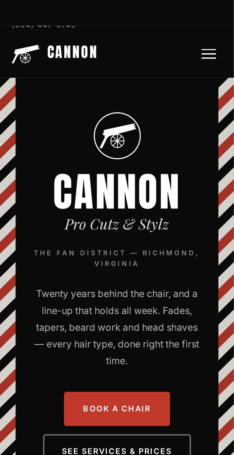
Cannon website on mobile

Fig. 3.8 — Mobile

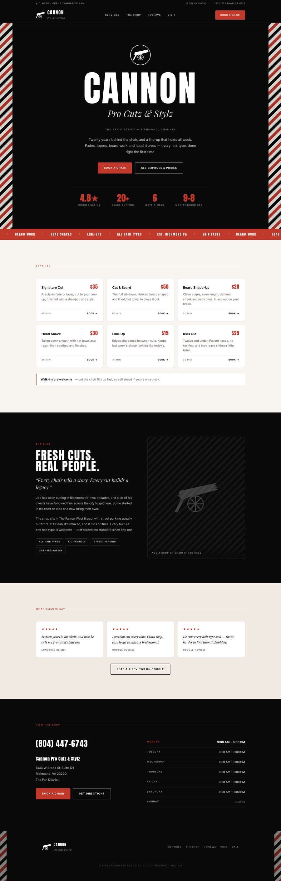
The complete Cannon Pro Cutz & Stylz website, full page

Fig. 3.9 — Full page composition

20
Years behind the chair, finally reflected in the brand
01
Designer — every deliverable, mark to layout
04
Core services given their own visual identity
00
Designers before me — the shop had never had one
Delivered
  • APrimary mark, secondary marks and full lockup set
  • BIdentity system — typography, palette, layout grid, photographic direction
  • CFull website design — layout, type, imagery, page structure — live at cannonprocutz.com
  • DApplications — signage, print, apparel, social templates