BBrandon Alvarez 01 / 03
§ 01 — Case StudyApp UI · Brand Design2025 — Present

Ummah Connect

Every Muslim community event in one place — posted in a minute, found in seconds.

Client
Ummah Connect — Ummah LLC — co-founded studio
Year
2025 — Present
Role
UI & brand design
Scope
Brand · App UI · Design system
Platform
Mobile app · Web
Status
Live
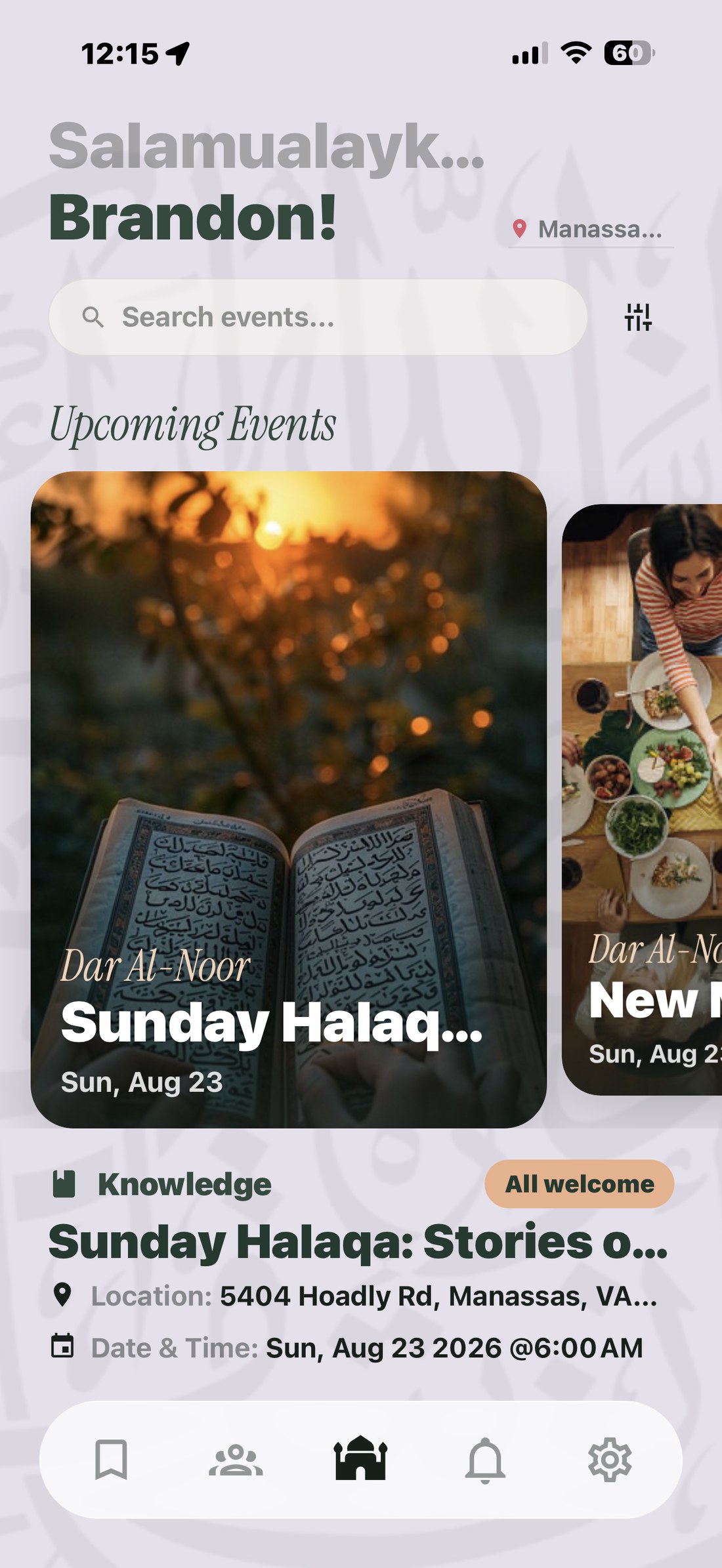
Ummah Connect home feed
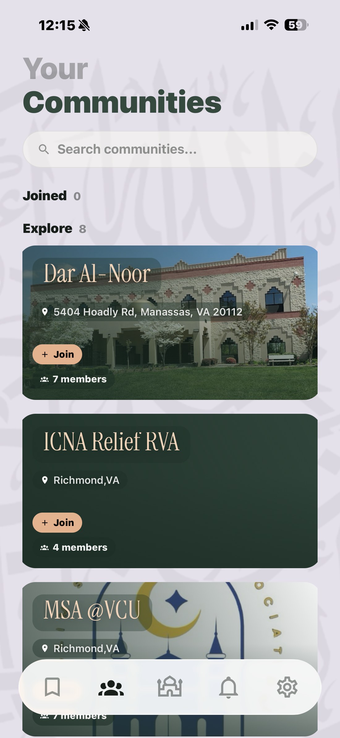
Ummah Connect communities
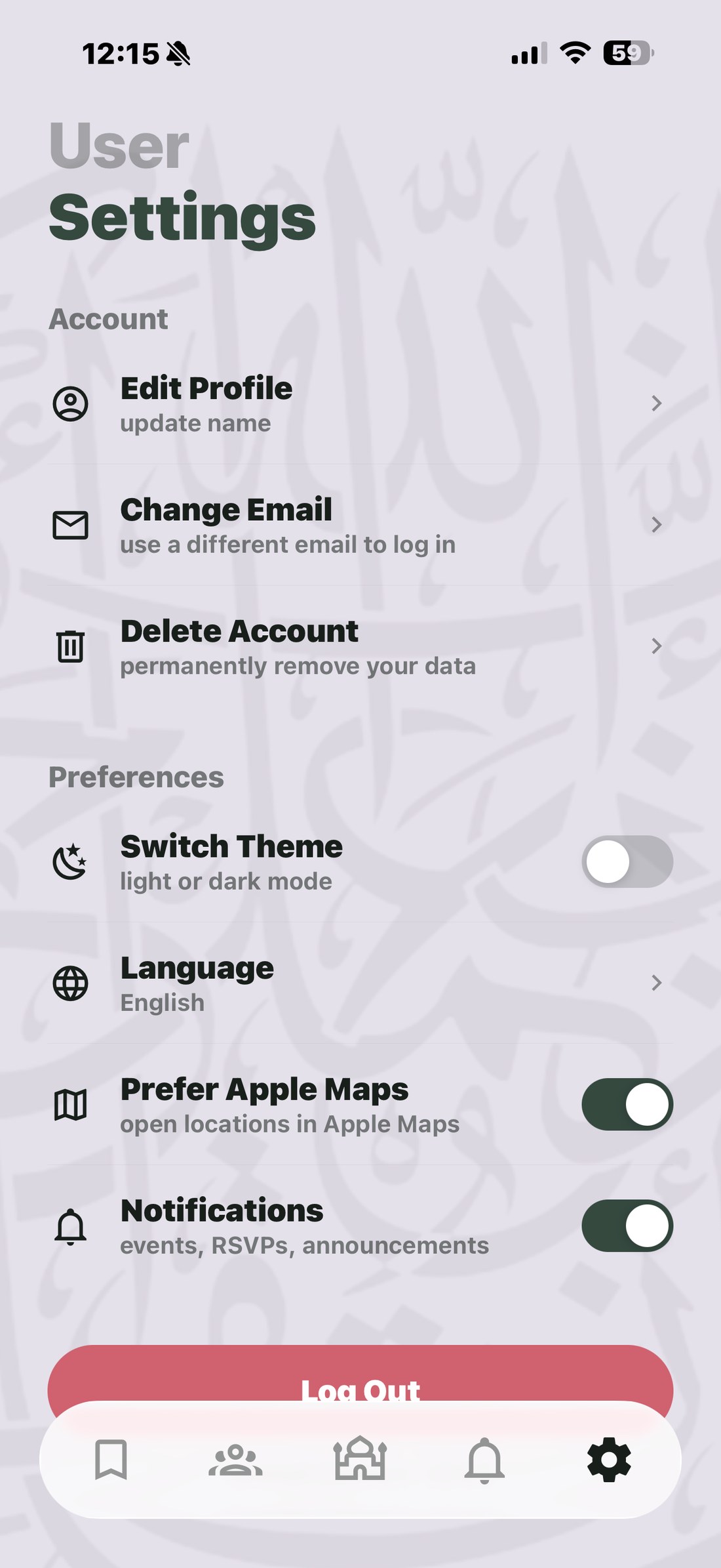
Ummah Connect settings
Fig. 1.1 — Home feedFig. 1.2 — CommunitiesFig. 1.3 — Settings
Overview

Muslim community events are everywhere and nowhere. A lecture gets announced in one WhatsApp group, a fundraiser on a masjid's Instagram story, a youth night on a flyer taped to a door. If you weren't already in the right group chat, you simply never heard about it.

Ummah Connect gives those events a single home. I designed the app — the brand, every screen, and the visual system holding them together. A developer builds it; my job is that it looks and behaves right before it gets there.
The Problem

Two audiences with opposite needs, and a platform that had to serve both without feeling like a compromise.

  • 01Organisers are volunteers, not marketers. Posting an event had to take under a minute on a phone, in between other responsibilities.
  • 02Attendees want relevance, fast. Location, time, whether it's family-friendly, whether it costs anything — answered before they tap anything.
  • 03Trust is the whole game. A community platform that looks improvised doesn't get used twice.
Approach

The event card does the work

Most of the app is one component seen at different sizes. I designed the event card to carry the poster image, the host masjid, the title and the date in a single glance, then reused it across the feed, the carousel and saved events — so the app feels consistent without me drawing four versions of the same thing.

Warm, not corporate

A deep green against a soft lilac ground, with a peach accent for anything actionable. Community apps usually reach for either sterile blue or heavy ornament. This sits between: calm enough to read, warm enough to feel like it belongs to somebody.

Calligraphy as texture, not decoration

Arabic calligraphy sits behind the whole app at very low contrast — present if you look for it, invisible while you're reading. It does the cultural work without competing with the content.

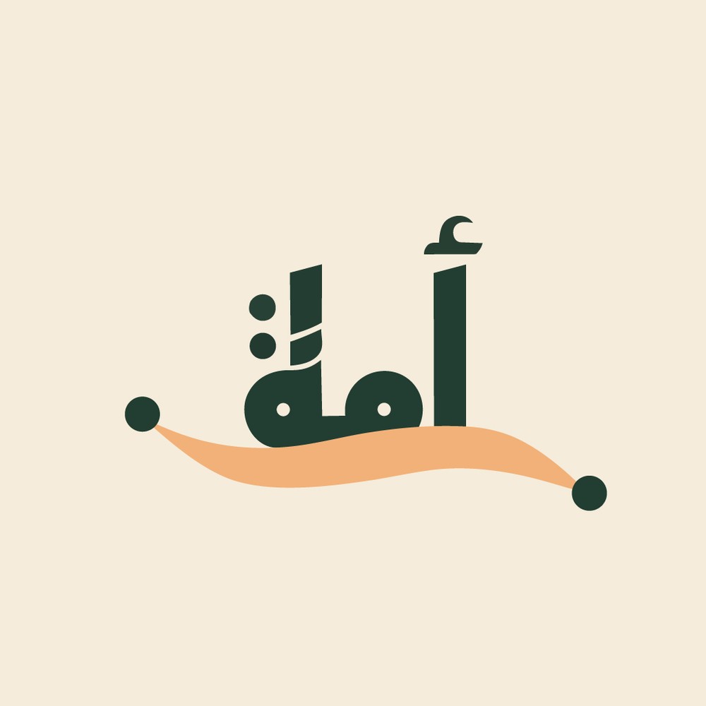
Fig. 1.4BrandMark & system
Ummah Connect app mark — the word ummah written in Arabic
Fig. 1.4 — App markأُمَّة

Fig. 1.5 — Palette, as built

Deep Green#24352D
Apricot#E3B38F
Lavender#E4E1EA
Card#F7F7F9
Alert#D0626F
Delivered
  • ABrand identity — wordmark, app icon, colour and type system
  • BEvery screen of the mobile app, in Figma, ready for build
  • CA reusable component set — cards, tab bar, forms, states
  • DLaunch and social assets
Outcome

Ummah Connect is live. The system has held up as features got added — new screens get assembled from components I already drew rather than designed from scratch, which is the only honest test of whether a design system actually works.