BBrandon Alvarez 02 / 03
§ 02 — Case StudyUI Design · Web App2025 — Present

Masjid Matrimony

The masjid's marriage service, out of the filing cabinet and into one honest record.

Client
Ummah LLC — co-founded studio
Year
2025 — Present
Role
UI design — member & admin views
Scope
UI design · Visual system · Design handoff
Platform
Web application
Sensitivity
High — private personal data
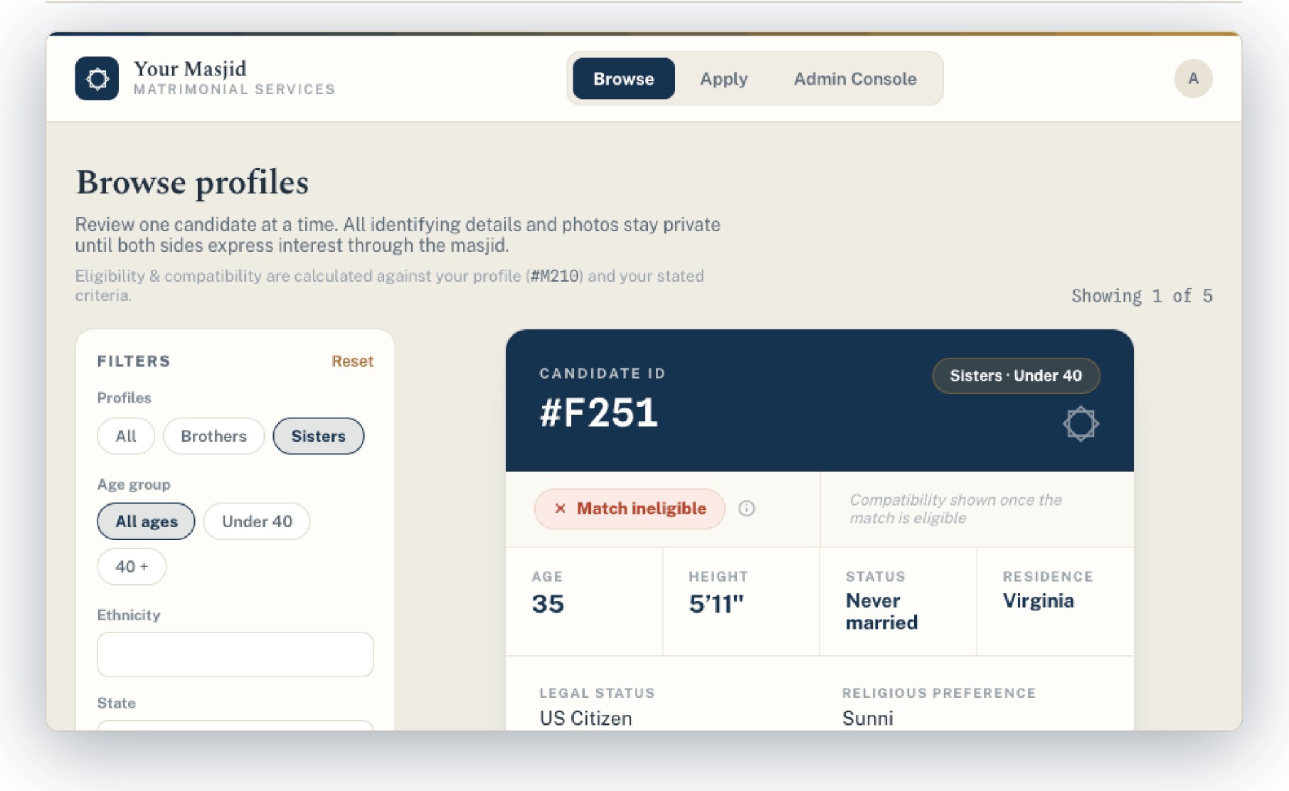
Masjid Matrimony — browsing a de-identified candidate profile
Overview

Most masjids run their marriage service on paper. Forms in a binder, a volunteer's memory, and a WhatsApp thread between two imams. It works until the person holding it all steps back — then the institutional knowledge walks out the door with them.

Masjid Matrimony gives a masjid one private, reviewed place to run the whole thing. I designed the interface — every screen a member sees and every screen the committee works in — plus the visual language holding both together.

The Problem

This is the most sensitive kind of data a community organisation holds, handled by people who are not administrators by trade.

  • 01Scattered records. The same candidate exists as a paper form, a spreadsheet row and someone's notes — none of them agreeing.
  • 02Privacy is non-negotiable. Who can see what, and when, had to be visible in the interface itself — not buried in a settings page.
  • 03Matching is subjective. Families weigh things differently. A single opaque "match score" would have been both useless and offensive.
  • 04Non-technical staff. If it needs training, it doesn't get used.
Approach

Nobody has a name until they should

Browsing shows a candidate ID — #F251 — not a name or a photo. Age, height, residence, status and religious preference sit in a plain data table underneath, with eligibility stated outright. I designed it to look like a record, not a dating profile, because that's the difference families actually care about.

A seven-step application that doesn't feel like one

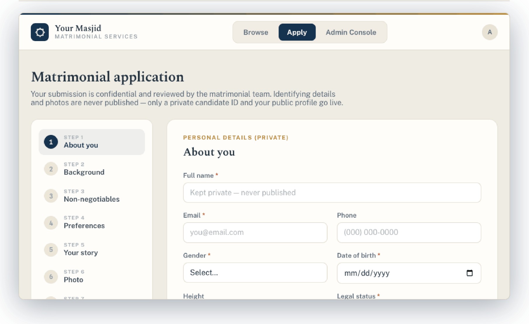
The application is long by necessity — background, non-negotiables, preferences, your story, photo. I designed it as numbered steps down the left with one card of fields at a time, and put "kept private, never published" directly against the fields it applies to rather than in a policy nobody reads.

Two products, one language

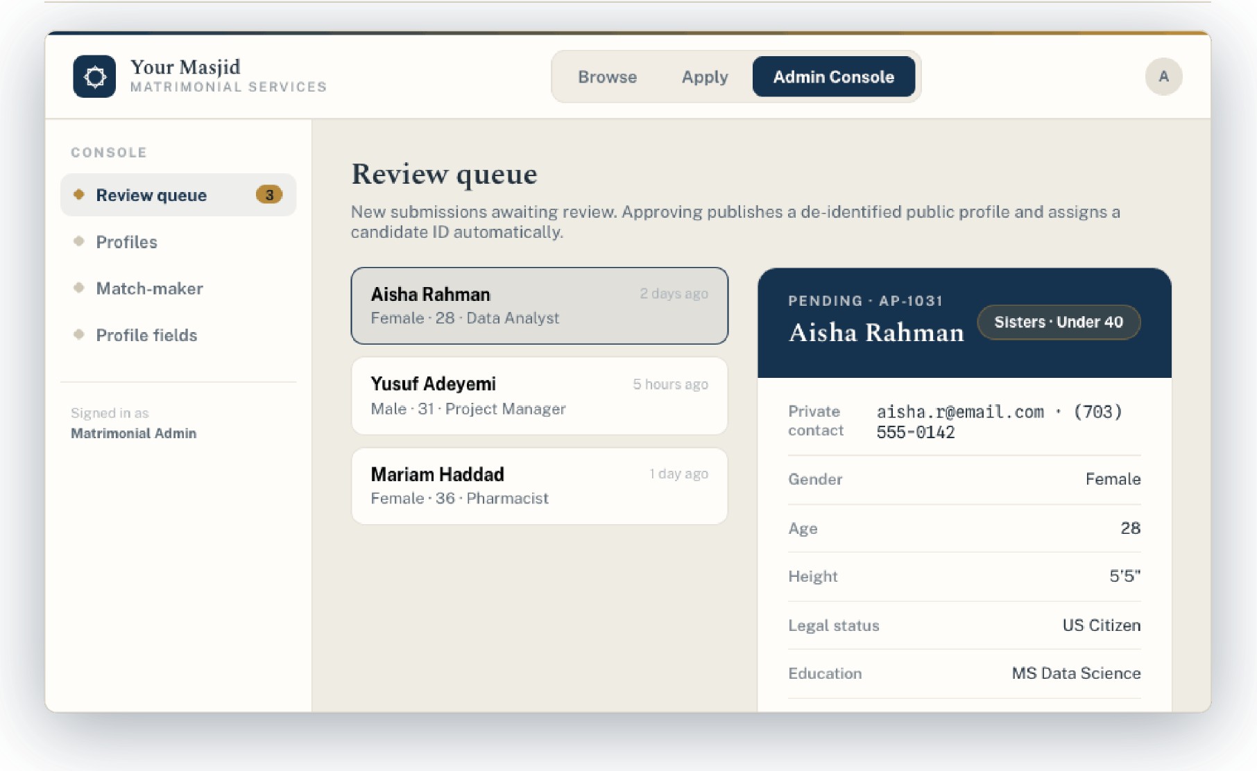
Members and the committee see different things, so I designed the admin console — the review queue, the match-maker, profile fields — in the same navy, bone and gold, with the same type. The volunteer running it should never feel like they've been handed the back room of somebody else's software.

Weight where the stakes are

Deep navy for anything committing, bone for reading, a single gold accent for labels and eyebrows. Serif headlines against a plain sans for data. It reads institutional and careful, which is what a masjid needs it to be.
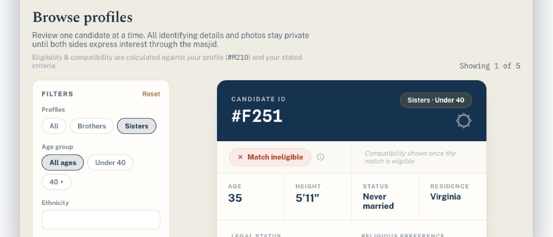
Fig. 2.1InterfaceSelected screens
Committee review queue
Browse profiles
Matrimonial application
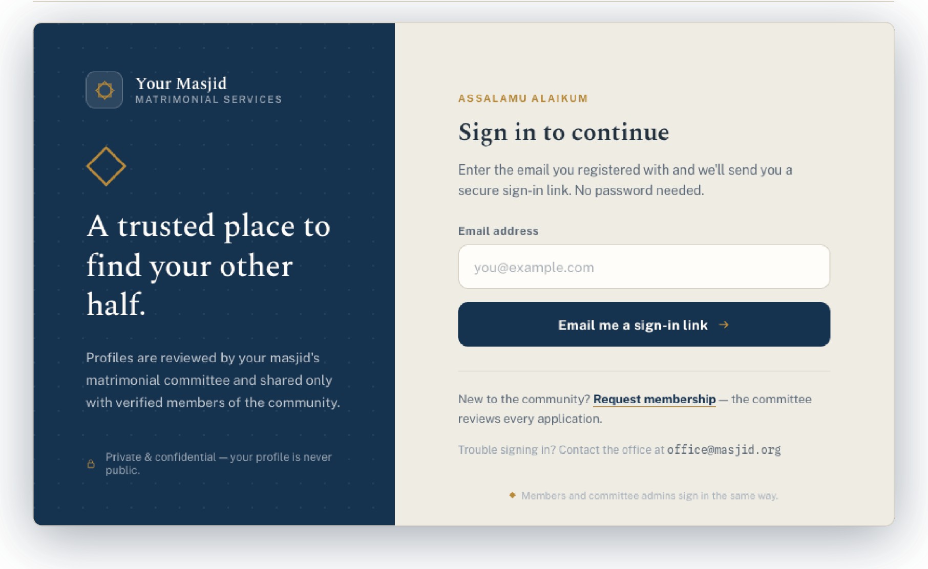
Sign in
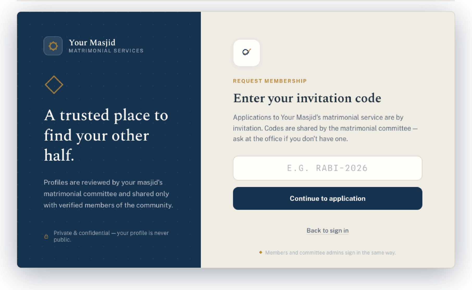
Invitation code
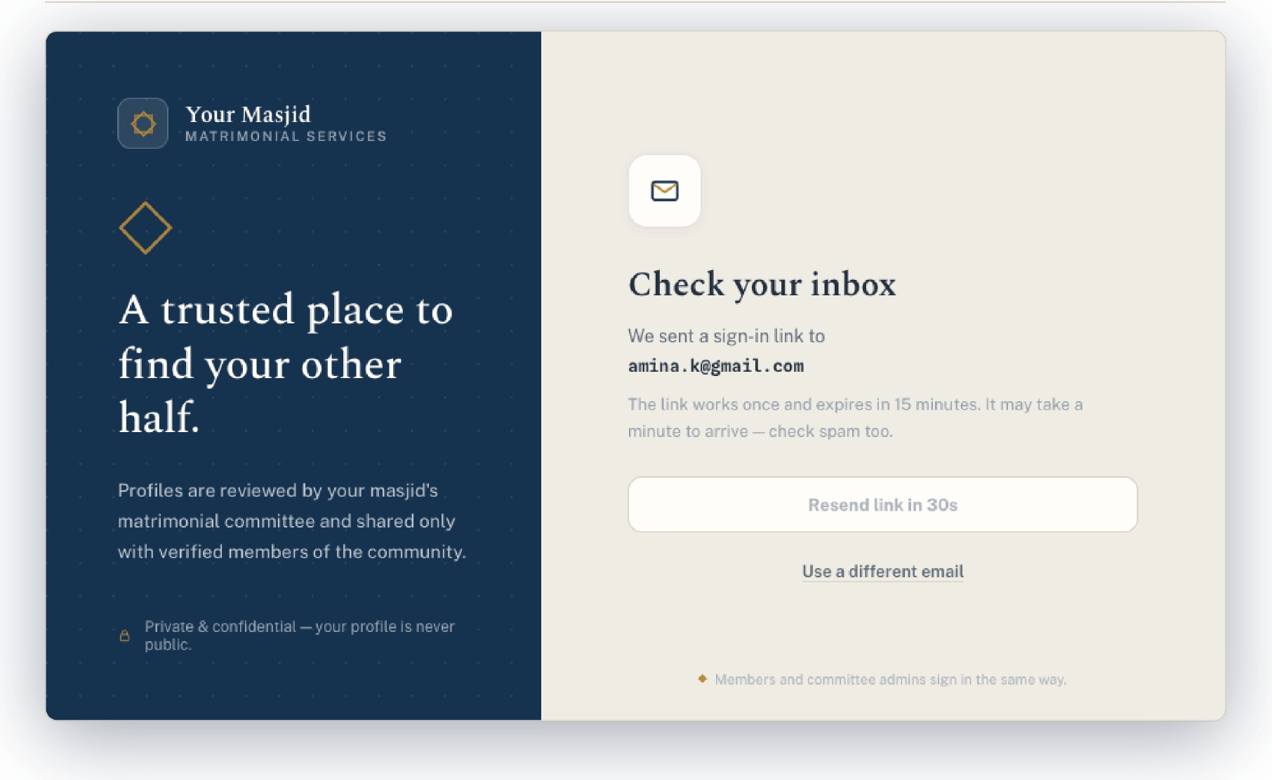
Check your inbox

Fig. 2.7 — Palette, as built

Navy#15334F
Gold#B98532
Bone#EFECE3
Paper#FFFFFF
Delivered
  • AEvery member-facing screen: sign-in, invitation, application, browsing
  • BThe committee admin console: review queue, match-maker, profile fields
  • CThe visual system — palette, type pairing, star mark, components
  • DForm, table and state design, handed off for build
Outcome

What I'm proudest of is the restraint. In a category full of swipe cards and match percentages, this reads like an institution's record system — which is exactly what a masjid needs it to be.